How False Color Helps With Retouching?
In science, false color is a color rendering method for data visualization where the object is not shown in its true colors — the way we would normally see them — but using a different color rendering method depicting one or more aspects of the data. Think of a thermal imaging camera, an elevation map, or an MRI scan.
Used in cinematography, and consequently, photography, the term usually refers to a feature on monitors and cameras for visualizing exposure in the form of IRE levels, colored using a specific color palette. It is especially useful when a scene’s exposure level is difficult to dial in or consistency is paramount.
Mapping data for retouching
In retouching, we often want to deal with aspects of an image, like tone, colors, and texture, separately. Sometimes we only need to correct a small color inconsistency without changing the brightness of the same spot, or we just want to change the texture and nothing else. In these cases context really matters as other aspects can influence the way we perceive the values we would like to manipulate.
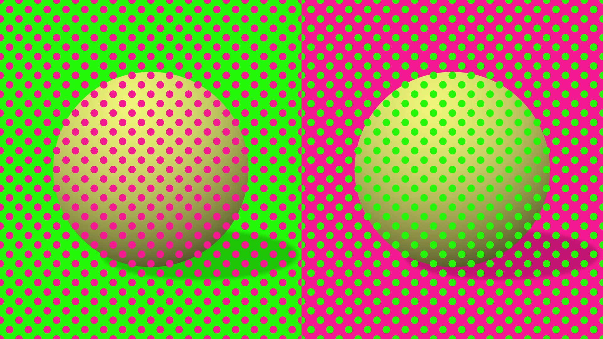
A good example on how much influence context has on our perception is the following Munker optical illusion: the two balls appear to have different colors. In reality, they are exactly the same, and only appear to be different because of their surroundings.
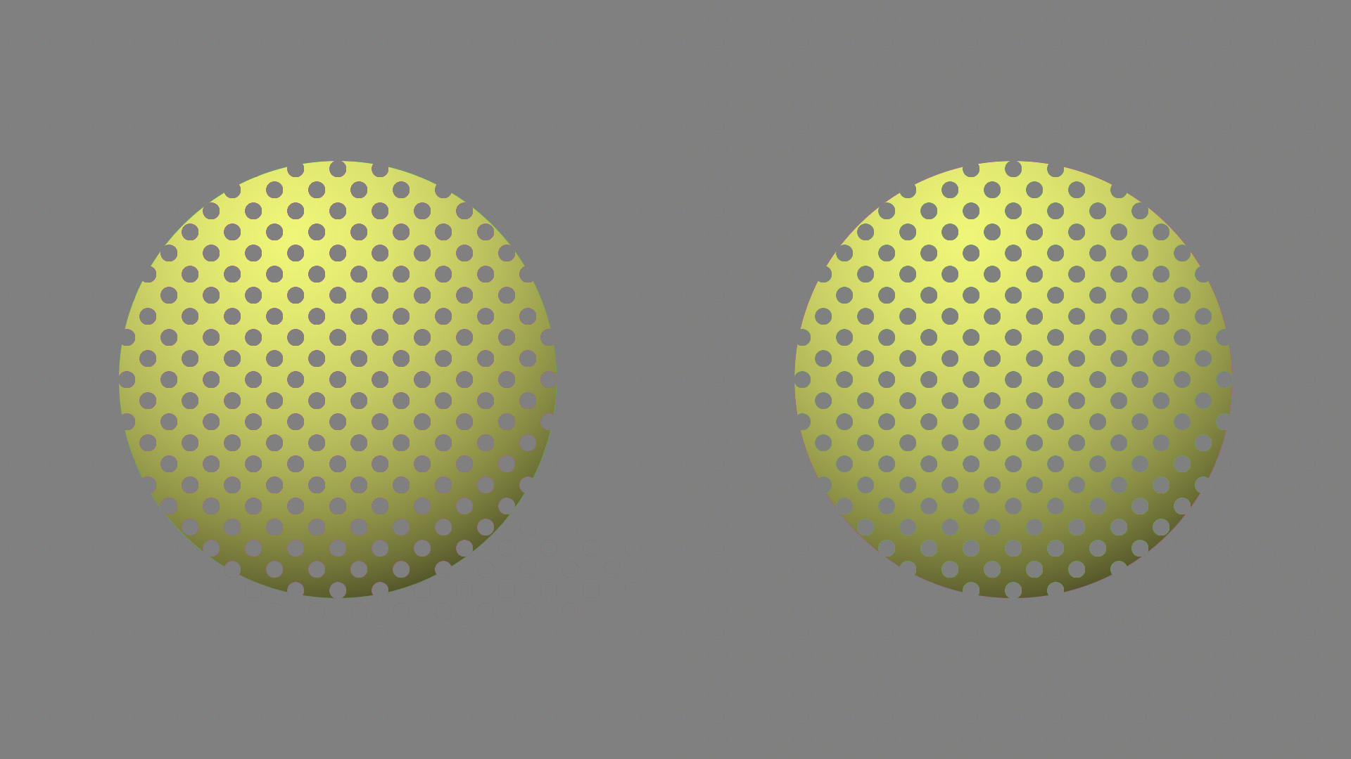
In this case, I could map the neon green and magenta colors to 50% grey and apply it to the image as a very specific “false color” overlay. This would show that the colors are in fact, identical. Of course, this is a bit silly as this mapping would only be helpful on this particular image but it shows the power of data mapping and isolation.
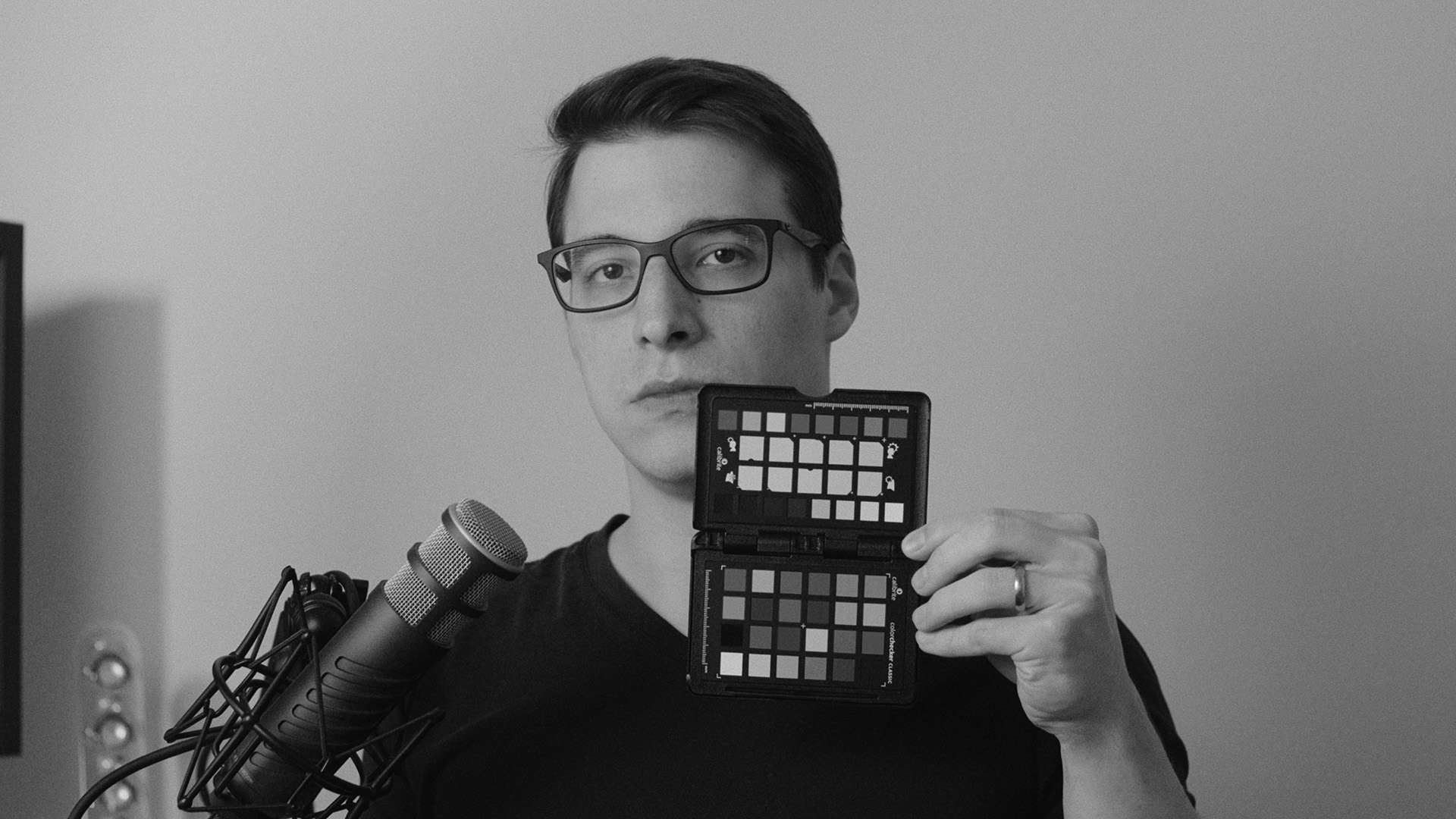
A more practical example would be brightness mapping to aid dodging and burning. The act of dodging and burning is about changing the brightness (lightening and darkening) of targeted areas. Therefore, during this operation we have no need for color information, and in fact, having color present can negatively influence the way we perceive levels of brightness in our image.
Creating the brightness mapping is actually quite straightforward. Take the RGB value of a pixel, calculate how bright it is — preferably using a method that takes human perception into account —, then apply that value to all channels (red, green, and blue) creating a monochromatic representation of the underlying color values. This eliminates the color information from the image and aids you in making better decisions about what to darken or lighten.
If this was not enough to convince you how useful false color is in retouching, let me show you another example. One of the main pillars of retouching is the smoothing of gradients. This includes all gradients: in hue, in saturation, in brightness, and sometimes even in texture. However, some of it is hard to see because they are so intertwined (e.g. hue and saturation). This is where my next example comes in: saturation mapping.
Using saturation mapping we are able to map, you guessed it, saturation values to any other value. You could take all 0% saturation pixels and color them black, while 100% saturation pixels would be colored to white while interpolating between those to get the values in between. Of course, if you wanted to you could use any other color, as well.
The process is similar to brightness mapping with a few differences. The RGB value is now first converted to a cylindrical color model that has a chroma or saturation component, like HSL, HSV, or LCh. Then, we take only the saturation/chroma component and remap it to our RGB values according to the bit depth (255 for 8-bit, 65,535 for 16-bit). Finally, we apply the remapped saturation value to all three color channels.
This, just like the previously described brightness mapping method produces a monochromatic result. However, you can always recolor it; I just find black and white to be sufficient for this.
Note
Depending on which cylindrical color model you choose when mapping saturation values you will get different results because all of them interpret colorfulness (chroma, saturation…etc.) differently.
How to use in retouching
Now that we understand how powerful false color is and what we can use it for in retouching, we need to talk about how to use it.
The easiest way is, if the processes I described above can be applied in your image processing application in a non-destructive way, to just create it as separate layers above everything else. In Photoshop, for example, it is remarkably simple to map brightness values to corresponding monochromatic values in a way that is perceptually accurate.
Simply create a Solid color adjustment layer on top of your layer stack, set its color to any grey values (black, white, or anything in between with 0% saturation), and then set the blending mode to either Saturation or Color. This will preserve the luma of everything that is below, while adopting the saturation of the top layer. The reason you can choose Color blending mode as well, is because the Hue component will be discarded as the Saturation is set to zero.
Another, arguably better, method is to create LUTs for these conversions. LUTs, as their name suggests, convert one color value to another based on a lookup table. Hence, it is easy to see how the previously described pipeline can be adapted to a LUT based workflow.
Not to mention that LUTs are universal. The same LUT can be used in Photoshop, Affinity Photo, After Effects, DaVinci Resolve, and anything else that supports one of the major LUT formats.
In this recording of a live stream I did some time ago I am authoring a couple different LUTs using C. The method I am showing can be done using any programming language. Even without any prior coding experience the VOD shines some light on how LUTs work.
